Mobile App UX Design Mistakes That Can Lead To Loss of $300 Million or More
- UI/UX
- March 16, 2024
We all know that a well-crafted mobile app UI can lead to 200% and UX design up to 400% conversion rates. But did you know that even a single blunder during the mobile app UX design can lead to a significant loss of up to $300 million or even more? Our guide covers all need-to-know mobile app UX design mistakes you should avoid that might lead your brand to failure.
“I have not failed. I’ve just found 10,000 ways that won’t work,” Thomas Edison answered when asked about the reason behind his success in creating the incandescent light bulb. This quote has become an inspiration for many entrepreneurs to avoid mistakes and achieve success. The same principle applies when it comes to designing a mobile app that your business depends on.
You can try multiple trends and mobile app design best practices to bring your dream app to life. However, there will be many mobile app UX design mistakes that are inevitable, errors that can be reduced, and don’ts that must be avoided at all costs.
When you’re running your business, which will rely on a mobile app to lead the future, you can’t afford to make mistakes associated with design. This is especially crucial when revenue in the app market is estimated to grow to $673.80 billion by 2027, at a CAGR of 8.83%.
Hence, in this blog, we’ve covered must-know mobile app UX design mistakes that you must avoid.
But before that, let’s first know…
Benefits of Excellence Mobile App UX Design
The visual appearance of your mobile app interface plays an essential role in defining the trustworthiness of your brand/business. If your target customers are pleased with the product experience your mobile app offers to achieve their goals, they are likely to become your brand influencers, which can offer many benefits like:
- Higher user satisfaction levels
- Increased user retention rates
- Higher conversion rates
- Positively improved brand reputation
- More trust from users and repetitive customers, leading to competitive advantages
- Higher user engagement.
These are just a few of many that we have mentioned in our blog on the benefits of excellent mobile app design for business.
Common Mobile App UX Design Mistakes To Avoid
Given the increasing competition, it is imperative to deliver an optimal experience to users. Anything less than perfect will likely be discarded in favor of competing apps.
The first thing you must perfect is the UX design of your app. Here are the common mobile app UX mistakes you must avoid:
#1 Not Understanding Your Users & Competitors
Often overlooked stage in the mobile app design process that contains the potential to streamline everything in terms of business planning and targeting audience.
Avoiding research and planning in the mobile app design can result in poor app presentation and not being able to address solutions users might be looking for or could even end up offering a frustrating user experience.
During the mobile app design research and planning stage, designers and businesses often end up making the following mistakes:
Ignoring The Essence Behind User Research
Doing user research for the mobile app design helps a lot to know about who will be using your app, user demographics, preferences, pain points, and motivation factors to use your app. This information further becomes a reference for designers to design the app accordingly.
However, many businesses overlook the importance of user research. They do this by considering it as a burden to time and cost, or considering they have knowledge of their right users (though in the broader term).
Skipping research and planning during mobile app design has severe consequences, including poor user experience, wasted resources, brand damage, lost revenue and competitive setbacks.
Not Prioritizing Competitor Research
In a business, though you’re performing well, it’s a must to know what competitors are up to. There might be chances that they have made some mobile app UX design mistakes that have cost them a fortune, and you’re about to fall for the same.
In this dense market, where over 6 million mobile apps are deployed across Google Play Store and Apple App Store, having a heads up from competitors can help you outperform the market competition.
If you don’t do the competitor analysis nicely, you could end up with app design, leading you to follow the rat race, which, of course, you don’t want to do. This helps you be clear on your business terms and service offerings.
Not Clearly Defining User Personas
It’s great that you’ve considered user research and going ahead with user persona creation. If not doing this with focus and well-set criteria, you might end up under-defining user personas, leading to potential business losses.
You can make the following mistakes when defining user personas for your mobile app design:
- Creating a multiple number of personas can lead to confusion and distraction.
- Basing personas on assumptions rather than real data can result in inaccurate representations of users.
- Adding unnecessary information, such as hobbies or favorite colors over core aspects that matter, like motivations and pain points.
- Failing to consider the context in which users would need to use your app.
- Not identifying negative personas that do not fit the target audience.
So, when creating user personas, you should keep it limited to 4-5 personas only – depending on your app type, following the user research, and be focused on your app mission.
#2 Not Prioritizing Information Architecture & Wireframing
Information architecture and wireframes for the mobile app act as the blueprint for designers. Making a mistake at this stage can disrupt the entire flow of app user navigation and user experience. During this stage, you can expect the following common mobile app UX design mistakes that most of the businesses have done and can do:
Not Following The Consistently Organized App Information Architecture
Be it in design or any sort of presentation – consistency is always the key. This is even more important in the design planning phase to not get lost in the later stage.
Let’s understand it with one reference: You’ve opened a food order app to order your favorite pizza from your preferred outlet. When the app loads, you don’t find the search bar placed on the top but rather somewhere hidden in the bottom with a small magnifying glass. It took almost a couple of minutes to discover that feature.
So, that’s the disorganized information architecture of that app.
When speaking in terms of Information Architecture (IA), it has been in an organized manner as it becomes the guide for organizing and structuring content in a way that users can find intuitive.
It includes logical grouping of the content serving the same purpose, clear navigation, consistent layout – allowing users to find app features intuitively, and intuitive labels for easy user reference.
Poor information architecture can negatively impact user experience, leading to frustration and confusion, ultimately leading to decreased user engagement and satisfaction.
Overcomplicating Navigation Menus
Navigation menus are the pathways users take to explore and interact with the various features and content of an app. When these menus are overcomplicated, users may find it difficult to locate the information or functions they need, leading to frustration and potentially causing them to abandon the app.
To avoid this, you should thoughtfully plan the mobile app navigation at the time of information architecture. Please remember that simple, intuitive, and well-organized navigation menus are crucial for better usability and overall success of your mobile app.
Thinking That Skipping Wireframes Can Help To Save Time
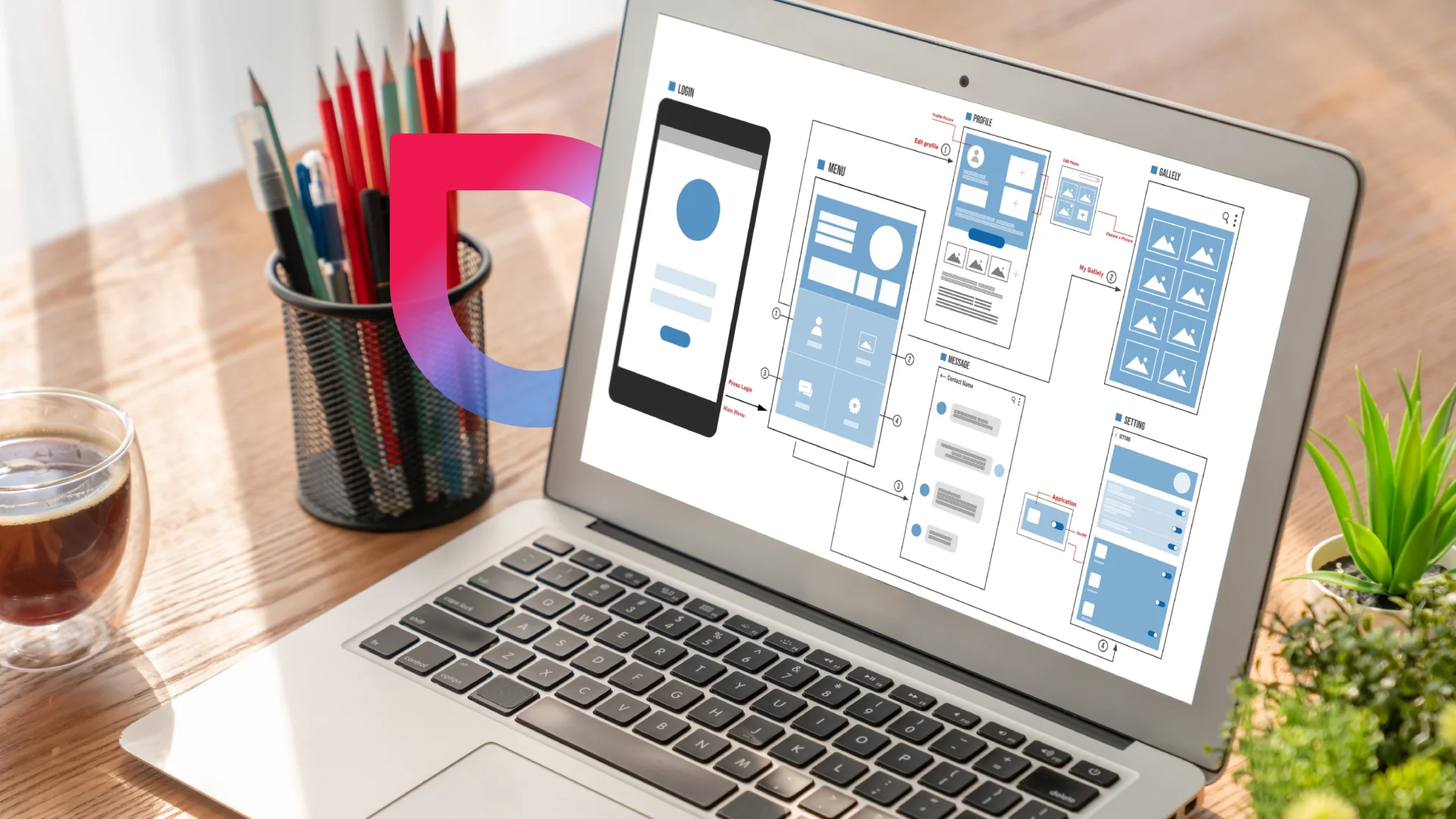
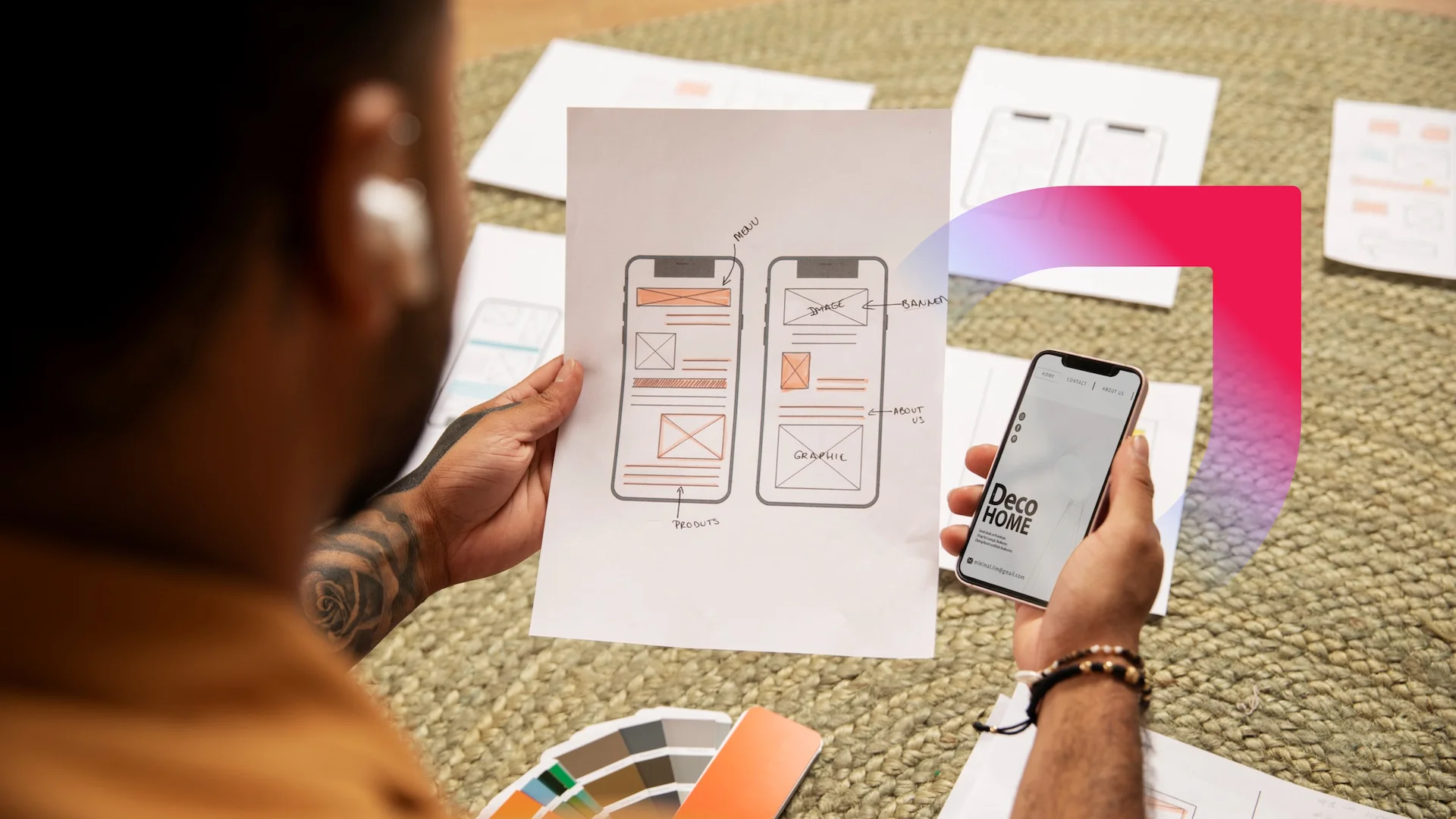
Wireframes are the blueprints/skeletal framework of a mobile app design outlined with the structure and layout of different screens that guide designers to iterate the design till they achieve a stunning and intuitive user interface.
When businesses miss out on its intricacies, they may face a lack of clarity in the design idea, more design revisions, design inconsistencies, and higher costs due to fixing the complete design again and again.
This is not just it – skipping wireframes can also lead to poor user experience, increased development time, and making the project suffer from scope creep.
So, when thinking of mobile app development, at the time of design, don’t just think about temporary but long-term ones. Investing in wireframing can save time and resources in the long run, leading to a more efficient and successful startup and enterprise mobile app development process.

Not Optimizing The Wireframes With WhiteSpace
Whitespace also known as negative space is essential to prevent the UX from seeming overwhelming. A successful app balances between content and whitespace.
Understand that your app requires breathing room to best highlight the features and elements you want to showcase to your users. Trying to offer everything by using up all the space on the screen will only increase the rate at which you lose users!
A great example to learn from is the failure of Google Wave. While initially hyped up, the app eventually failed because its interface was overwhelmed with features. The overly complicated design, along with its underperformance, led to its downfall.
#3 Skipping or Not Creating Interactive Prototypes
Mobile app prototyping is the most crucial stage before the full-fledged app design process that gives businesses ideas on how their product would look post development.
After wireframing, this digital product prototyping is often overlooked in order to save an extra penny. But to save a few, they are missing out on the calculation of a big loss that can incur if not prioritizing it backfires.
Creating interactive prototypes is essential for validating design concepts, gathering user feedback, and aligning stakeholder expectations early in the development process.
Though knowing all of its benefits, businesses could make this mistake due to reasons like:
- Considering perceiving extra cost
- Time pressure
- Lack of awareness
- Overconfidence in the initial design
- Lack of skilled personnel
- Perception of prototypes as optional, and many others.
Missing out on creating interactive prototypes can lead to user frustration, lower engagement rates, higher costs, negative reviews, project delays, and even higher costs associated with late-stage revisions.
#4 Failing To Meet Certain Mobile App Design Considerations
After planning and structuring the mobile app design, it’s time to design the mobile app user interface and experience. This is a stage prone to making many mobile app UI/UX design mistakes if not approached considerately. Here, even the slightest mistakes can cost a fortune to a business.
So, it’s must to know the mistakes you can expect when actually bringing the visuals of your mobile app to life:
Poor User Onboarding Planning
Though you’ve planned your app to be designed in an intuitive way, it’s a plus point to add the onboarding screens. This approach helps to get users familiar with the app from their initial interactions so that they can learn to use the app expertly.
However, many either skip it or don’t give much importance to its design and the insights it provides. This is the biggest mistake app makers are making.
When we say poorly designed, we mean it by designing it:
- By adding too much information
- With a lack of clarity in terms of the purpose of the app and vague navigation
- With too many screens and steps to remember with no skip options
- With no personalization
Following all of these mistakes, your app can suffer from user frustration and higher app abandonment rates.
Hence, you should follow the mobile app onboarding screen designing best practices, which we have mentioned in this linked blog.
Not Designing The App For Simplicity Yet Elegance
All the popular apps of today have one thing in common – they have a highly simplistic interface. Remember, the consumers of today live a highly fast-paced life. They need seamless and quick design solutions.
Anything that is too complicated for users to navigate is automatically abandoned by them. When developing an app, rethink its features. Gauge whether the navigation and the features provided have a purpose. Can it be done in a simpler way? If yes, then redesign.
Airbnb is one app that excels due to its navigation and interface. The app categorizes a user journey into five screens rather than adding it all in one go. This helps in maintaining simplicity while not compromising on intuitiveness and functionality.
Failing To Design For Accessibility
In the mobile app UX design, accessibility stands for not designing for it to be visually catchy and easy to skim through but also making the app accessible and usable to all sorts of users regardless of their physical or cognitive abilities.
Key accessibility features include screen reader support, high contrast text, keyboard navigation, and alternative text for images.
Not designing the app for accessibility can lead to exclusion of users, negative reputation, lower user engagement, and even legal issues as many regions have legal requirements for digital accessibility (e.g., the Americans with Disabilities Act in the U.S.).
Poor Typography Choices
In the visual appearance, everything matters, even the choice of typography. If it’s not aligned with the app design theme, it can result in poor user experience. Not everyone has a keen eye for the typography that goes well with the theme.
At MindInventory, we have designers with a keen eye for typography who help our customers get the best design assets meeting their app type and industry standards.
Lack Of Clear Calls To Action (CTAs)
Definitely, you’re creating an app to make users perform certain actions that support your mission. In order to guide them to click on the action, you’ll need calls to action (CTA) buttons that get you more sales conversions. To be precise, CTAs are essential for directing user behavior, encouraging engagement, and facilitating the achievement of both user and business goals.
However, many businesses fail to use the power of CTAs by not clearly stating actions, optimizing them for better visibility, maintaining consistency, and, most importantly, missing places where CTAs could mean something to users and guide them to decision-making.
Because of poor CTA design, businesses face lower conversion rates, user frustrations, and less engagement of users with the app.
Intrusive Advertising And Pop-Ups
We know that you want to offer your many services to users. However, doing aggressive advertising within the app or bombarding the app with many or frequent pop-ups can frustrate users and make them abandon your app.
Let’s say when a user opens an app, and an advertisement pops up in the next couple of seconds. That’s fine, but it should be designed with a visible close button. However, it is important to plan the pop-ups in a way that sounds relevant to what they are visiting the app. If not, it is just a desperate attempt and has the potential to harm the brand’s reputation.
Not Optimizing Design For All Screen Types
Responsive design is a must in this age where users have competitive options to explore if they’re not satisfied with your app’s user experience. Every user uses different phones with different screen sizes, which requires you to optimize all design assets as per different screen ratios. Missing out on this can lead to significant app abandonment rates due to poor user experience.
#5 Not Giving Much Importance to Design Testing & User Feedback Cycle
Mistakes during the testing and feedback stage of mobile app development can significantly impact the final product’s quality, usability, and success. Here are common mistakes made during this crucial phase, along with their consequences and ways to avoid them:
Not Testing The Design With Actual/Prospect Users
Once you’re done crafting a mobile app design, it’s a must to check its success by testing its accessibility, usability, and visual appeal with real users. When doing so, many make testing mistakes like:
- Testing with a small or non-diverse group of users can result in feedback that does not represent the broader target audience.
- Not simulating real-world usage scenarios leads to context-specific issues users may encounter.
Because of these mistakes, brands may miss out on critical app usability problems and even end up with features that may not meet the needs or expectations of the broader user base.
Ignoring User Feedback
After the user testing, you receive the user feedback, which must be analyzed and implemented in the design. Just like Snapchat did during its 2018 release, addressing the negative feedback from users and fixing where the app design was lagging. You’ll read its case study in the latter section.
Here, you can make mistakes in user feedback analysis in two ways:
- Failing to address critical or negative feedback has the potential to lead to recurring issues.
- Ignoring user suggestions for improvements can result in missed opportunities for enhancement.
Because of these mistakes, brands may lose the trust of users and opportunities for potential app enhancements.
Mobile App UX Design Mistakes Done By Well-known Brands
If you think most of the mobile app design mistakes are done by startups, then you’re wrong. Even big brands like Snapchat, Google, and Apple, do make mistakes in their app design, and they have paid hefty prices for their design mistakes. Let’s read their case studies:
Snapchat Case Study
In 2018, Snapchat received a major backslash as a loss of $1.3 Billion of its market value when it redesigned its app majorly by adding new features from which many are useless or difficult to use. Because of this, Snapchat has received around 1.25 million users signed a petition to roll back the design update. Kylie Jenner was also one of them and called the new update “so sad” through her Tweet.

This forced Snapchat to learn from its mistake and prioritize user research.
Google+ Case Study
Google+ was launched in 2011 as a social networking platform intended to compete with Facebook. However, it struggled to gain traction and ultimately shut down in 2019.
The reasons behind this shutdown were overly complicated and difficult to navigate app user interface and many other disclosed software design flaws that led to lower user engagement rates.
Despite significant investment, Google+ failed to attract a substantial user base and was ultimately shut down. The failure highlighted the importance of user-centered design and clear communication in building a successful platform.
Apple Maps Case Study
When Apple launched its Maps application in 2012, it aimed to replace Google Maps as the default mapping service on iOS devices.
Users encountered significant inaccuracies in mapping data, including misplaced landmarks and incorrect directions.
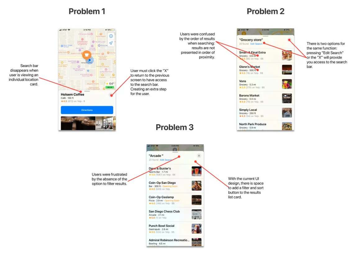
Apart from that, to finalize the one out of many places with the almost similar names also confused users to find the one they are looking for due to unavailability of search filters and sorting.

This unavailability made the Apple Maps face many comparisons with Google Maps and that too in a negative way. The backlash was immediate, leading to public criticism and even a rare apology from Apple’s CEO, Tim Cook. The negative reception impacted Apple’s reputation, prompting the company to invest heavily in improving the app and data accuracy.
How UI/UX Designers At MindInventory Can Assist You
This shows that in the world of mobile app development, ensuring a seamless and engaging user experience (UX) is crucial for success. Avoiding the UX design mistakes mentioned above can make a significant difference in your app’s usability and user satisfaction.
The designers at MindInventory are well-equipped to help you navigate these challenges. With their expertise in creating intuitive, user-friendly designs and their commitment to following best practices, they can ensure your app not only meets but exceeds user expectations.
By partnering with MindInventory, you benefit from a team dedicated to delivering excellence through innovative design and thorough testing. So, need expert UI/UX design services for your mobile app project? Share your requirements with us!!!
FAQs about Mobile App UX Design
In the mobile app UX design, there are myths like users will figure it out (even if the design is complex), aesthetics over function, more features are better, and the same desktop app design principles apply to mobile app design.
When designing a mobile app interface, designers have to mainly consider screen sizes and resolutions, touch interactions, simplicity of the navigation, and context of use through design.
Popular tools like Adobe XD, Sketch, Figma, and InVision, are mainly used for mobile app design.


