UX Design Best Practices for eCommerce Stores That Guarantee Better Sales
- UI/UX
- October 12, 2022
We all love to do shopping and online shopping – to be specific, incredibly when our schedules are running tight. But nobody wants to visit an online store with not so eyes-pleasing design, placements, and ambiguous information.
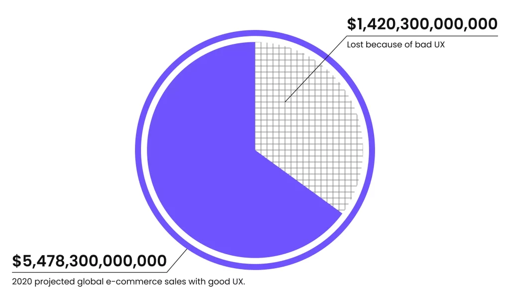
One survey affirms that around 88% of online shoppers avoid revisiting eCommerce stores with bad UX.
Being a team of designers, we understand the pressure you’re facing to put all UI/UX design pieces together for your eCommerce store.
As UX is a major sales-driving force for the eCommerce industry, you probably don’t wanna miss this opportunity to shine.
This blog is specifically created to help you get the best UX design ideas to infuse into your eCommerce website or mobile application.
What is UX in an eCommerce Store?
In simple terms, UX design for eCommerce stores (website + mobile apps) is a gateway to getting into your target audience’s head. Also, ensure to offer them a simplistic, intuitive, logical, and joyful shopping experience.
Be it eCommerce mobile app development or eCommerce website development, UI UX design plays an important role. UI focuses on getting users’ first attention with creative design. Nevertheless, UX wins their hearts by providing them with the smooth app functional experience they need.
However, in the race of superiority – UI and UX – User Experience (UX) plays a broader role, which you’ll see in the next section.
Why is UX important for eCommerce Stores?
In the realm of digital designing, UI is the queen, then the UX is the king alongside content, which leads business to success.
Let’s take one example:
You walk into the fashion shop, looking for the specific style of clothes and accessories that one brand has offered in its latest TV commercial. You search the entire category menu but are unable to find your preferred product.
So, you’re in search of store assistance, but sadly all customer service executives are busy attending to other queries.
Now, how’re you feeling? Disheartened?
It is obvious to feel in such a way. And with that sad, disheartening feeling, you walk away from the store. So, you’ll call it a bad customer experience, and in the language of online shopping stores, it is called bad User Experience (UX).
The latest study on online shopping store business conversion reveals 69.99% eCommerce cart abandonment rate.
This is the major reason why your online store needs the attention of user experience design.
And that’s the reason why the world’s top IT-reliant businesses, like Google, Apple, Microsoft, Samsung, Amazon, Myntra, etc., are extensively investing in user experience (UX) design.
Here’s what Joanna Ngai, UX designer at Microsoft has to say in support:
“Design-driven businesses have outperformed the S&P by a whopping 228% over the past 10 years. The bottom line is, good design = good business.”
In short, you could say that “UX is your ultimate asset to business revenue growth.”
Given such importance, when thinking about growing a business, your doors to redesigning UX are always open to experiment for better improvement to become a design-driven online store.
But the question is, “How Does User Experience (UX) Create Conversions?” Let’s move to the next section for better insights.
How Does Better UX Design In eCommerce Stores Drive Sales?
If you design your online store appearance by considering all user aspects, and they like your efforts, then you have your ticket to success.
Jeff Bezos – the founder and former CEO of Amazon, also affirms that “if you design an excellent online user experience, your users are likely to spread positive words about your brand.”
So, it is all connected:

UX design is highly responsible for making and destroying eCommerce brands, which does not only limited to aesthetics.
Starting with clear logic and transitions to granular user interactions, faster response time, smooth payment flow, and tons of appealing features, these all things set the bars for your eCommerce game.
Hence, you must take care of the eCommerce components to ensure a positive user experience.
7 eCommerce Store Components’ UX To Take Care
Now, let’s have a look at making eCommerce important components or pages look appealing for a better user experience:
1. User Interface
Though we say UX design plays a vital role in the success of any software, it is incomplete without User Interface (UI) design. After all, UX adds final touchups and puts the soul into the UI design.
The user interface focuses on making users’ journeys across the software application easy and sound. Also, letting the user know the whole idea of how your app works.
In terms of the online store, you should focus on making users understandability for the working and accessibility of your e-store with its UI.
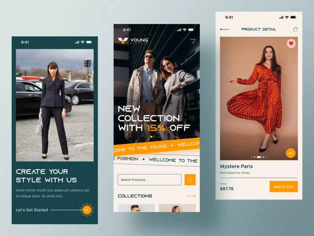
The best eCommerce UI must have transparent branding all over its landscape with advertising enablements. It will enable your business partners to use your branding elements to showcase their partnership with your brand and vice versa for you.
2. Clean Home Page Layout
Your eCommerce platform’s home page layout is the first impression on users. Even the way you create your ecommerce landing pages can play a huge role in enhancing the user experience.
Let’s start with its important sub-components:
A. Highlight The Product Value With UseCase and Deals
We understand that you’re eager to sell your products to the customers. With eagerness, many eCommerce sites end up following bad practices for showing all the technical features of the product at the start. It might be a good case for some users but not for all.
Your homepage’s first section should provide information about how the product can help users and ease their work in simple one or two-liners, which create value for users. Also, by reading the product value, users must feel curious to know more about it.
When thinking of value, it could be a price, discount, or main product application information, with its appearance and texture visualization. Just as “mamaearth” is following by defining how the customer can benefit from your eCommerce store in terms of products and price.

So, in short, it is all about managing the product’s appearance effectively and real as it is with an impressive content presentation to attract more users.
B. Make Search Field Accessible
Okay, you have collaborated with top product brands while creating your products. Each product category is high-class and up to the trend with what today’s Gen-Z people need. But how will they reach the product they need? Of course, by some navigational fields that are known as the search fields.
If you have too many product varieties to sell, then categorization is necessary, along with one search bar for custom query searching. Product categorization makes it easier for users to find their products under their preferences.
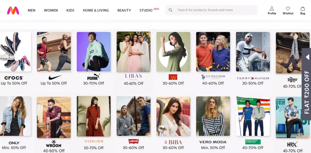
Just as Myntra is providing perfect cataloging of products on the home page with discounts and brand labels, offering the best user experience.
Also, Amazon creates a great user experience by providing complete information as per users’ search behaviors with easy navigation on the home page only, which saves users ample time in online shopping.
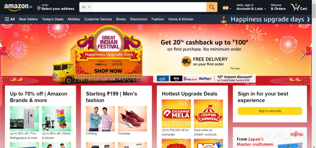
This is the simplistic UI by seeing any user would get an idea from which section they can expect what functions. That’s the reason it is being used by millions of users globally.
3. Grid Product Search Pages
Product pages in the eCommerce site showcase users particular product categories from different vendors and ranges.
A. Effortless Navigation with Grid Layout
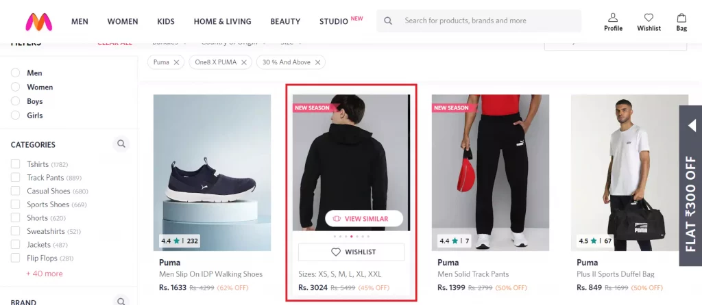
When searching for products, what users want is that they can see more than one product on their single screen along with images, prices, offers, shipment details, etc. In that case, a Grid product layout fits the best.
Not just that, users also want some filter and sort functions to find the product under their budget and color, fabric, brand, etc., preferences.
Many famous online shopping stores, like Myntra, Amazon, Flipkart, etc., offer similar navigation.
Here, we have taken the example of Myntra. It, along with those categorizations and selections, also offers a view to finding similar products from different brands with different prices when hovering the mouse on any product grid and clicking on the option “View Similar” field.
B. Show Best Sellers in Products
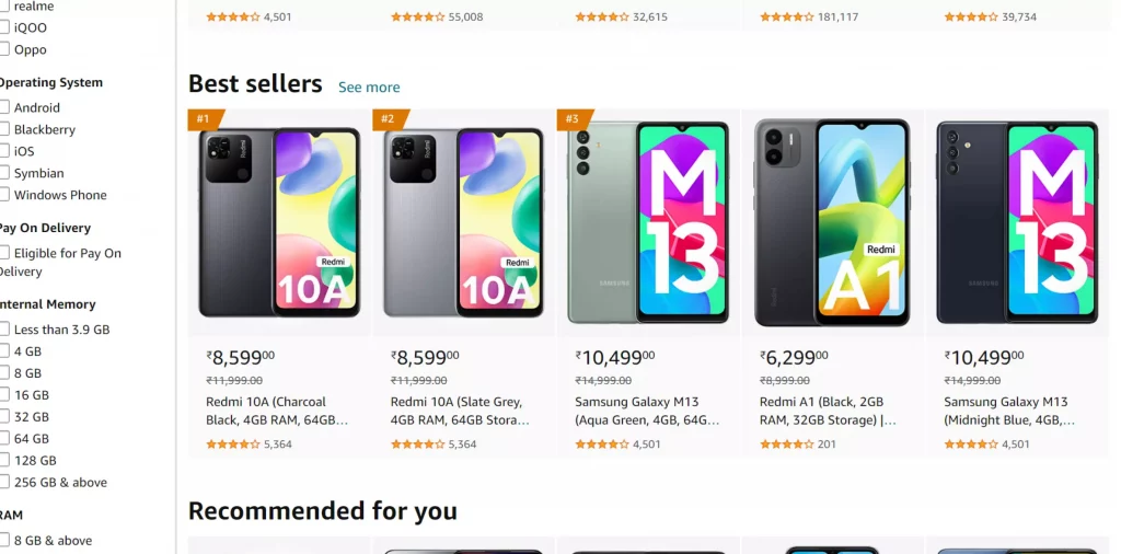
When you’ve got a lot of products listed in your online shop, you have to ensure that your users don’t get confused by seeing varieties of products. Hence, highlighting some best sellers, limited period offers, new arrivals, etc., labels are important. It creates a great guiding user experience to complete their shopping as they’ve targeted.
See the below image of the Amazon product search page for the Best Sellers representation.
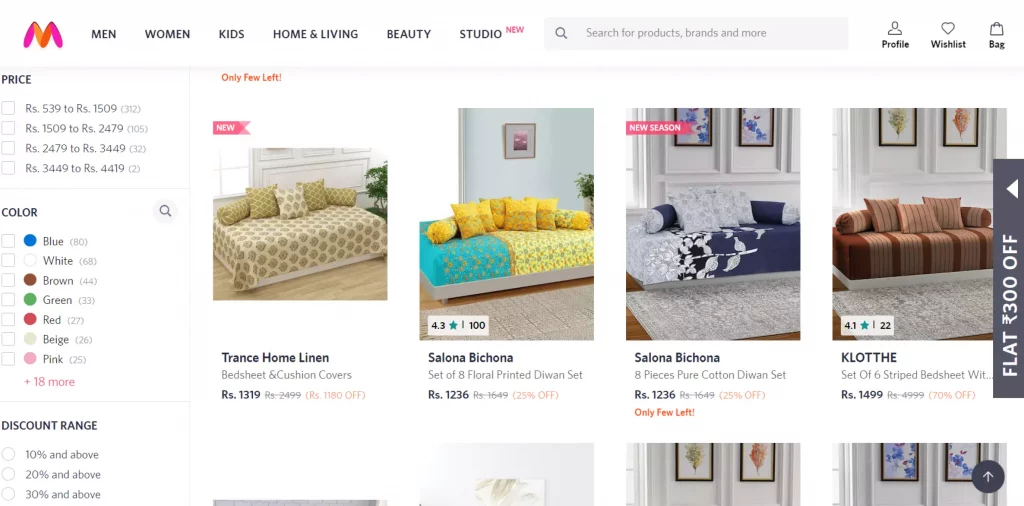
When speaking of more labels like “new arrivals”, “NEW”, “New Season”, etc., Myntra is indeed offering great labeling on products along with sorting and filtering options.
4. Informative Product Detail Pages
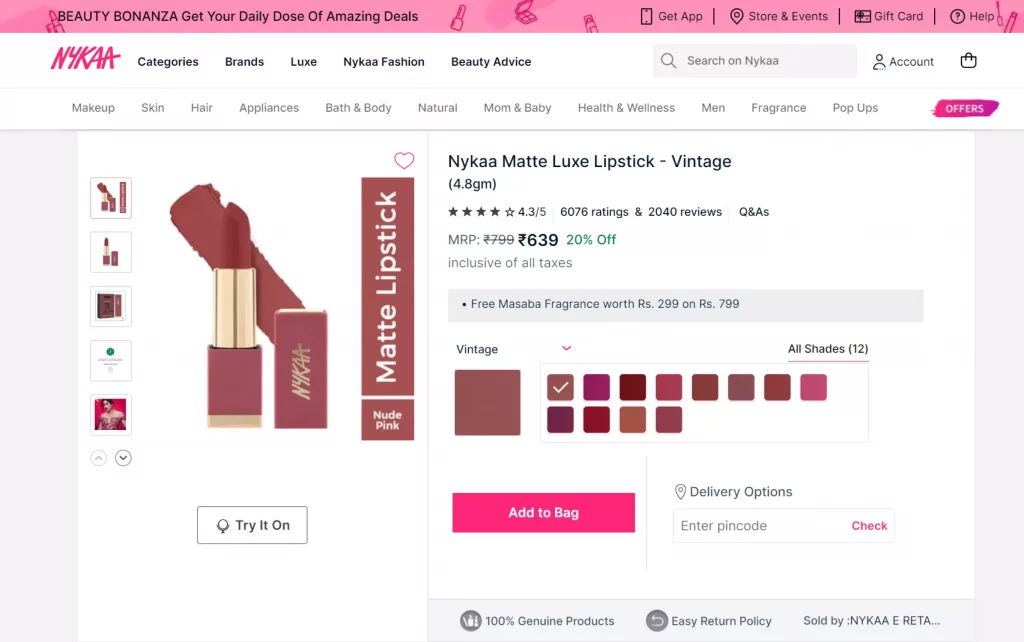
What do you think a product detail page should have? It could show many details, like:
- Product images from different angles
- Product name or title
- Prices, discounts, and limited-time offer with countdown offer
- Product size and color selection section
- Pincode for a delivery time estimation
- Product Descriptions – about its style and main use, material details, color, etc.,
- Bank and Payment card offers
- CTAs: Add to Cart or Buy Now
- USPs of your eCommerce platform, like 7 days return/exchange policy, 100% genuine products, etc.
- Similar product grids
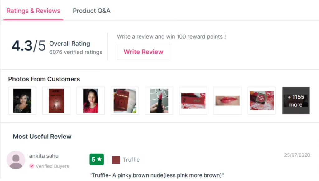
- Reviews & ratings
- FAQs
The more information and social proofs you add to your product detail page, the more effective user experience it will create to make their purchase from your shop. Along with content, its representation is also important to make the sale possible.
See the below image for a better understanding of the way your product page should look like:
For customers’ satisfaction with the product quality, it is also important to show Reviews & Ratings. See the below image for further reference:
5. Simple And Straightforward Checkout Pages
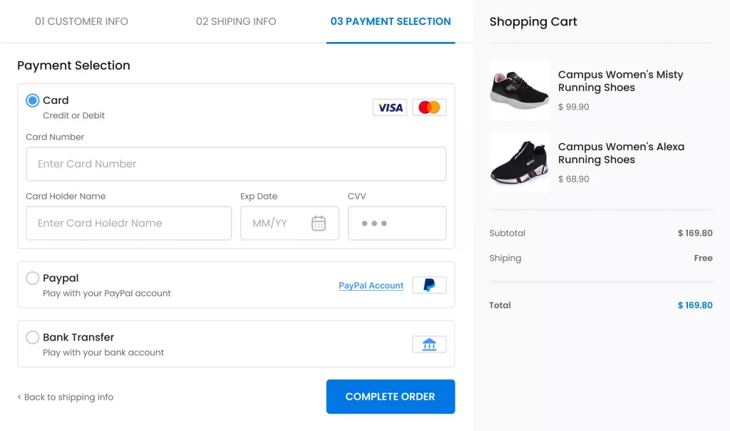
Online Shops’ checkout process is the same as checking out from offline stores that offer home delivery. It asks for information like payment details, adding address and contact details, confirming the price with applied offers and discounts, then making a payment to finally place the order.
So, when designing a UX for the online stores’ checkout pages, ensure that consumers should have details like how many stages/steps the checkout process would be completed.
See the below image for better reference:
By adding the checkout form, you can ensure to get users’ data to pitch them your best deals in the future. And asking for such information is also known as asking to Sign Up for new users and Login for existing users.
In the case, a new user lands on your eCommerce site, you even allow them to buy as a guest user.
6. Login and Sign Up Page
After becoming a fan of your eCommerce site, users want to come back to your store. Hence, they create a profile to save their favorite products and other payment details.
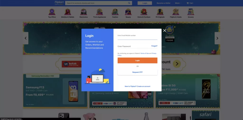
When thinking about user preferences and making their work easier with UX design, ensure that you ask for only limited information to simply Create A Profile/Log Into the profile.
The information could include:
- Phone No./Email ID
- Username
- Create A Password followed by Confirm the Password field
- Auto Signup/Login options with Google, Facebook, or Apple account link options.
To do something unique, you can even mention the benefit a user will get on the first purchase. While designing and arranging all, do ensure that you follow the branding of your eCommerce business.
See the below image that replicates a good UX design for the Signup/Login form:
7. User Profiles (User Persona)
This is the home of the user from where users can edit all their personal information, such as user name, user bio, category interests, wishlist, payment information, premium points, etc. Some eCommerce sites also allow users to make their profile public to be an influencer for their brands.
Here’s how a user profile can be designed to give them a personalized space-like experience:
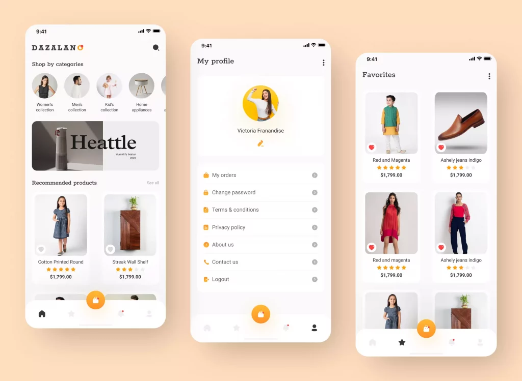
So those were the tips for designing a compelling UX for the important eCommerce components. Now, let’s see some experts’ tips on UX design practices to improve user experience.
Experts’ Tips on UX Design for eCommerce Stores You Can’t Overlook
Let’s dive into the core user experience (UX) design tips to make sure you don’t miss any designer’s touch in your online shopping store.
Simplistic Primary Navigation
In the eCommerce store, app navigation to the functions plays a vital role. Hence, no matter what, it shouldn’t be compromised.
As discussed above, ensure that you include every important detail on the home page. Be it product categorization, latest deals and sales, running offers in brands, featured products, personalized product recommendations, way to manage a user account, etc., it is important to put them in the right place.
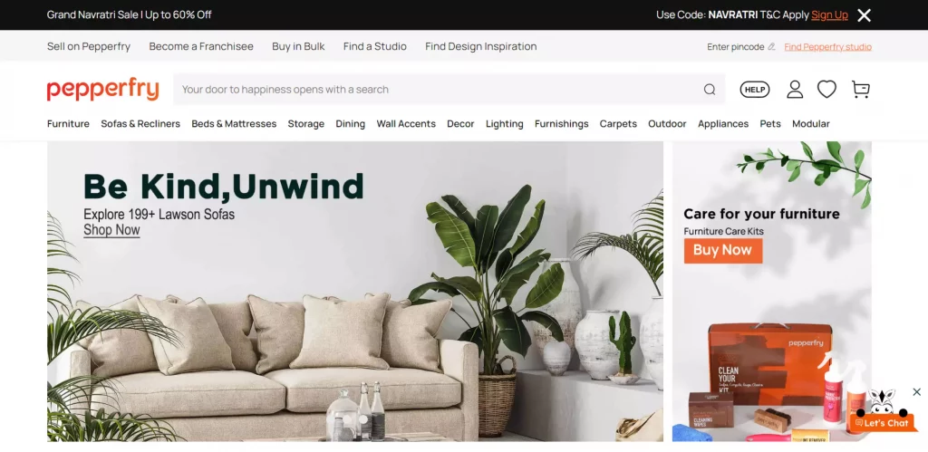
While arranging everything, also ensure to give some attention to the strong CTAs and CTA button design and effects. Sometimes a direct window to direct buy also becomes useful in getting sales conversations.
Ensure Minimalism (Aesthetics)
Minimalism is becoming a new normal in the world of design by adding simplistic aesthetics. In online shop UX designing, a minimalistic design approach largely focuses on product pages, snippets, typography, etc., which makes a product detail page appealing to the users. After all, it is all about providing a high-quality user experience that drives business conversions.
Use High-Resolution Images
When searching for a product online, what customers see first is, “how attractive images and graphics you’ve used?” Because of that, high-resolution images play a credible role in driving sales because users trust appealing images providing useful information.
Here, the high-resolution image doesn’t mean putting some photoshopped stock image. It means using a picture of the original product and then editing it for a better visual appearance.
The more honest you become with users about your products, the more loyal they become to your online shopping site.
Responsiveness
No matter what type of software you’re developing, responsiveness for all types of devices remains prominent. Hence, make your eCommerce site’s user experience flexible to meet all devices’ screens’ aspect ratio. This part needs the attention of both UI design and UX design in order to ensure the visual appearance.
E-Commerce UX Design Checklist Keeping Business Point Of View
Along with design considerations, designers also need to do some digging into business perspectives as the business is the main reason we are having this conversation. So, let’s know them:
1. User Research
User research is the first step with market research to ensure that you never miss a chance to shine on user trends. With this study, you’ll learn about the user types, their age group, their interests, their behaviors in particular, and so on.
Hence, doing extensive user research is necessary, even if it means sending them surveys to fill out. This will help you narrow down your target users.
2. Ensuring User Understanding For the Product
If the user is informed of the benefits your product provides, they will likely show their interest in buying your product. The question is, “how will you inform them?” Well, it’s a simple process:
- Create product-based images with features and functionalities
- Provide its users’ guide
- Ensure to include the clear product in a brief
- Reach influencers to promote your product and services, and so on.
3. Design Consistency is the key
No matter what happens, in the excitement of doing creative UI/UX design, avoid getting out of your branding guidelines. Remember, your branding guidelines are your unique differentiators.
So, your customer will know by just looking at your small glimpse of design. It could be by social media commercials, print materials, using branding everywhere across the website, etc.
4. Promote Frequent Amendments In The User Experience
Digital doesn’t work like “once designed, it would forever remain the same.” Sorry, buddy, that would never be the case! Your eCommerce website and mobile apps will always be in the maintenance stage with minor changes with time to provide users with an improved user experience every time they update your software.
5. Always Be In Your Design Bucket
Many times, designers, in order to do something out of the box, lose touch with the main motive of doing it and end up designing an ambiguous user experience. And we all know that it’s not good for business, distracting the customers with unnecessary attractive user experience. Always follow the branding and UX best practices to avoid losing the design’s sight.
6. Respect The Customers
Never think about getting web analytics results in bulk at any cost for the sake of figures. These are your target customers. You have to design your software UX and circular the marketing campaigns by keeping all target user considerations. It is a lengthy process, which takes time to circulate and get on track.
7. Quick Response Is A Need To Offer Top-Not User Experience (Better Site Speed)
Your design is the first in a line of the eCommerce store development process, but infusing UX in the design with the help of programming technologies is the main work. You’ll have to choose the best performing programming language and intelligent developers to do the honors with the UX.
How MindInventory Can Help You With The eCommerce UX Design?
In terms of creative design, innovation and artistry are at the core of our design team. Hire UI/UX designers from us to bring your dream digital product to life. In short, you can call them an Army of Creative Digital Design Artists.
At MindInventory, we are dedicated to helping our eCommerce clients with cutting-edge UI/UX design services to create exceptional online platforms. Be it any industry, understanding the industry and clients’ business motives to provide them with the right-fit software solution is our vision.
FAQs on eCommerce UX Design
Take and implement customers’ feedback frequently, improve site speed, better navigational UI/UX design, responsiveness in nature, simplicity in the checkout process, and so on.
There are five key principles in user experience design: Hierarchy, Consistency, Confirmation, User Control, and Accessibility.
Conversion UX designing is the process of keeping customers at the center of the designing and development process while putting more emphasis on including business perspectives in every design element and presentation.
