The Best Practices to Design Dark Mode for Mobile Apps in 2025
- UI/UX
- April 20, 2020
Over the last few years, dark themes have been the most requested features in app design. Last year, macOS launched Dark Mode and Google declared a universal widespread of Dark Theme at Google I/O 2019 Conference. Although it was once rare, now dark themes are the latest trends and have become widespread.
If done correctly, dark themes have a lot of perks. They can be read more easily in low light. They lower eyestrain. They can highly eradicate battery consumption, based on the screen.
To get the Dark Theme ready is important for a designer for his app. Nevertheless, it’s not easy to build a nice dark theme. You can’t just reuse colors or invert the shades. If you do, you will get the opposite of what you need.
Designing dark mode incorrectly increases eye strain and makes it more difficult to read in low light. Both Google and Apple made the dark theme an important part of UI. This theme’s low brightness gives safety in dark ambiance. Hence, while designing dark themes, make sure to make it delightful, balanced, and readable.
Why Should You Go For Dark Mode?
In this blog, we discuss a few tips to guide you to designing a dark theme for your app. Before that, let’s know the importance of dark mode:
1. A Popular Trend
The dark mode is one of the most demanding design elements that have been trendy since the last year. It is developing day by day as per the current market demands.
2. Prolongs Battery Life
Dark mode of an application saves a device’s battery life. The dark mode works amazingly on OLED screens to prolong the device’s battery life, Google confirmed.
3. Solves Health & Wellness Issues
The apps which feature too much brightness are harmful to your eyes if used in the long run. Here come the benefits of the dark mode. It relaxes your eyes to open and work on applications in the dark, solving these health and wellness problems.
Impacts of Unhealthy Dark Mode on Your Health
When you are reading a white text on the black background, it creates pressure on iris as it opens up more and receives more light and deformation of the lens creates a frizzier focus in your eyes. This is known as Fuzzing Effect or Halation, which is one of the biggest challenges of dark mode app design.
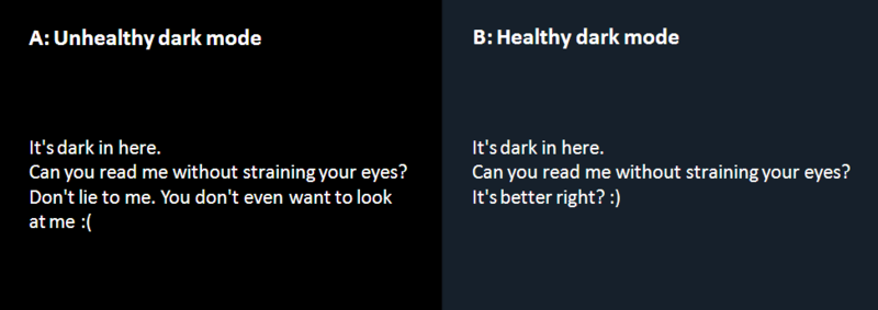
As the name denotes, unhealthy dark mode is harsh for your eyes due to its high contrast and they can stress them very fast. For instance, if you use your laptop or phone on the highest darkness, you already know how painful it is to read the entire text.
As mentioned earlier, dark mode helps prolong battery life. So, it just affects the devices featuring the OLED screen. When users are exposed to this impact, they feel exhausted by their digital experience. This is why proper designing of the dark mode is required.
Now that you know how unhealthy or improper design of dark mode impacts your health and wellness, let’s head on to the next phase of this blog!
What Changes Apple Brought to Design Dark Mode on iOS 13?
Using dark mode, Apple has returned the context of colors and UI styling in iOS. Let’s dig into the changes that Apple made for helping you design dark mode on iOS 13:
1. System Colors
Apple has brought nine predefined system colors that are supportive of dark system-wide appearance and dynamic. Hence, these colors modify to chosen interface styles.
2. Semantic Colors
To balance the feel and appearance of the iOS apps in both light and dark mode, Apple has brought semantic colors for usually implemented UI components.
These colors don’t feature the optimal RGB value; they alter to iOS interface style directly. Moreover, these semantic colors help deal with the overlay color and text in the dark mode.
3. SF Symbols
In the Human Interface Guidelines, Apple provides over 1500 SF symbols for designers and developers for use in their apps. Automatically they look great in the Dark Mode, which is why they have been optimized for both dark and light UI.
4. Blur and Vibrancy Effects
Apple has launched 8 vibrancy effects and 4 blur effects with iOS 13, which changes to the iOS interface style automatically. Moreover, Apple has launched 4 vibrancy effects in iOS dark mode typography suit – 1 for separator and 3 in the overlay.
How to Design Dark Mode for Mobile App Effectively
To give you a healthy UI experience, both Google and Apple have focused on their dark mode design standards. However, as we mentioned above, not paying heed to the dark mode design theme can result in a poor experience.
Thereby, you must follow the tips given below to design dark mode for mobile app effectively:
1. Refrain from Using Saturated Colors
Although saturated colors look amazing on light surfaces, they can vibrate against dark surfaces visually and make them more difficult to read. Hence, to make the contrast sufficient against the dark surface, de-saturate the main colors.
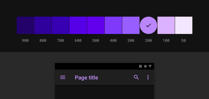
Go for using colors in the 200 to 50 range (those which are lighter tones) as they feature better readability on the dark theme surfaces. Lighter tones will not make your app UI less expressive, but they will maintain relevant contrast without paining your eyes.
2. Make Distant Surfaces Darker
One guiding rule is followed by the background colors in dark themes for UI elements: if the layer is closer to the user, the surface area becomes lighter. A light source is cast from above in this model that is analogous to an ambiance. If the layer is distant, it gets less light and recedes more into the background.
The designer can be tempted to invert the present light theme while making a dark theme. Nevertheless, closer surfaces would become dark and distant ones would become light. By breaking physicality, this would feel unnatural.
Rather, use just your light theme’s primary surface color. Then, invert the color to create your dark theme’s primary surface color. Now make this color dark for distant surfaces and light for closer surfaces.
3. Utilize ‘On’ Colors for Text
‘On’ colors are found on top of key surfaces and elements. Usually, they are used for text. For a dark theme, the default ‘on’ colors is pure white (#FFFFFF). But it’s a bright color and would vibrate visually against dark backgrounds. For this reason, Google Material Design suggests using a little darker white.
- Disabled text utilizes darkness of 38%.
- At 60%, medium-emphasis text is executed.
- High-emphasis text must have the darkness of 87%.
4. Decrease the Use of Large Blocks of Bright Color
Sometimes we use large blocks of bright color in light themes. Generally, this is okay: still, our most necessitous components are about to be brighter.
However, it does not work in dark themes: bright color’s large blocks are more focused among all necessitous elements.
5. Refrain from Using the Pure Black Color
The dark theme of your app should not be of complete white text on black background. It can be hard to explore a high contrast screen.
Go for using dark grey as the main color for the dark mode elements when you add the mode to your application. Using dark grey is safe as it reduces the eye strain and it is easier for you to stare at shadows on a grey surface in comparison with black.
6. Ponder Your Design’s Emotional Aspect
If you want to design the dark theme for your present app, you possibly need to communicate a similar range of emotions in dark mode. However, you must not do this because colors are recognized differently, based on their background.
Hence, a dark theme is unable to communicate similarly like the light theme. As a result, both themes induce various emotions.
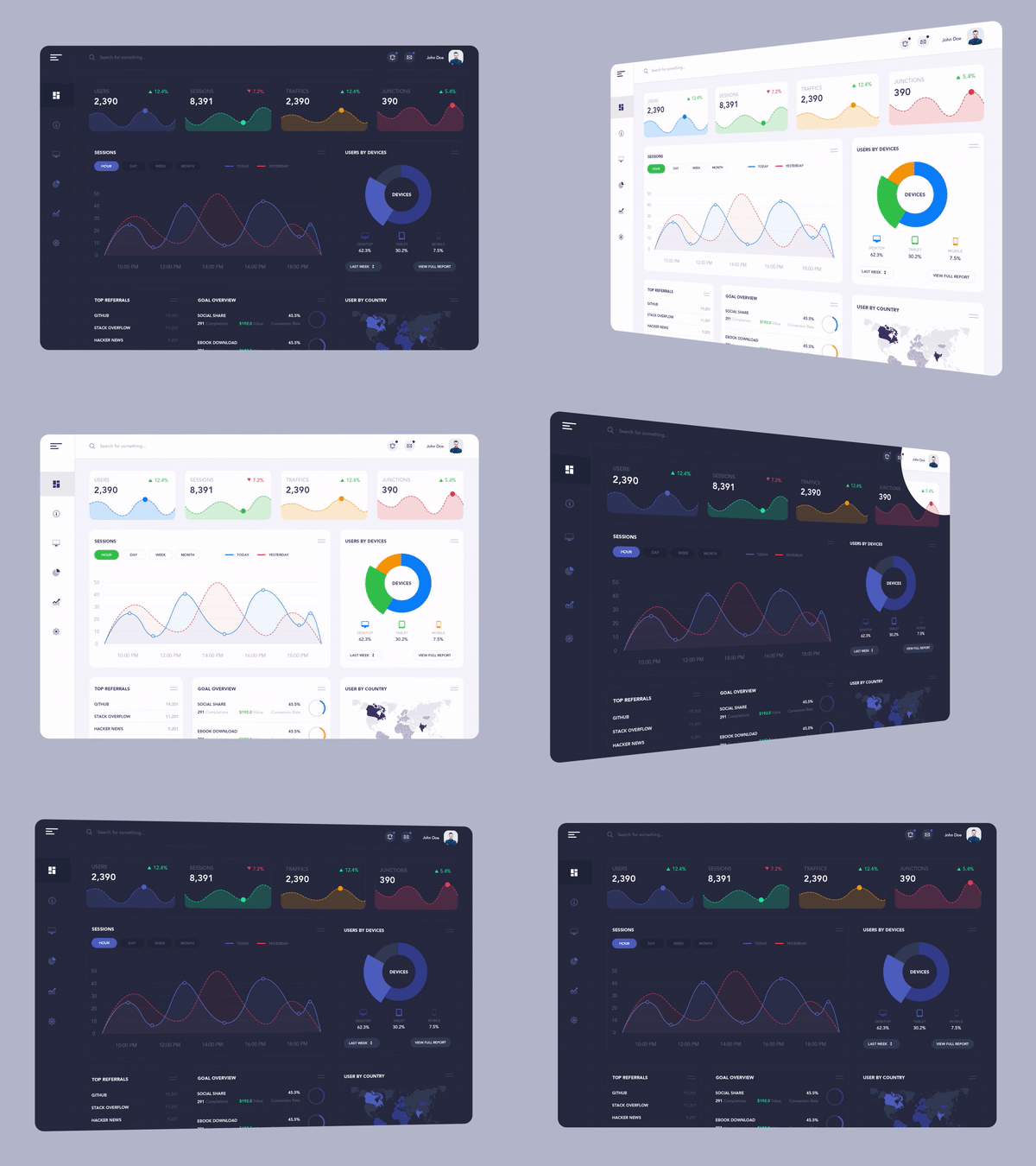
Rather than trying to solve this, you should better take benefits of this for the recognition of your product. A dark mode should not be necessarily derived always from the current light theme.
7. Deepen the Theme’s Colors
If you moderate your text to get rid of halation and eye fatigue, your colored buttons and accents may look very bright. And now you have to modify these colors for working better in a dark theme. So, first lower lightness so these colors don’t beat closer text. Then, maximize saturation so they have a character.
For instance, if you utilize the purple straight from the light theme, it seems very bright against the closer text. In the actual dark theme, you can deepen that color so the users can concentrate on their text.
8. Include Dark Theme into Illustrations and Animations
In case your application comprises of heavy graphical components like animations, you will need to be ready for their modification in dark theme also.
If the illustration consists of a background and a subject, you should better de-saturate the background colors completely to keep the focus on the subject.
9. Examine Your Design in both Dark and Light Themes
Look into the appearance of your UI in both themes and modify your designs as required for accommodating every theme. Test your product after twilight, with beaming lighting.
10. Permit Users to Turn the Dark Mode On or Off
Enabling the system to decide when to turn on or off the dark theme is exciting, isn’t it? Nevertheless, this decision can cause poor user experience as well. After all, this lets you take control of users and allow the system to make decisions for them.
Thereby, you should not go to auto-enabling a dark theme. Permit users to move from regular theme to the dark mode utilizing UI control. Users must be capable of choosing the mode manually, depending on their requirements. You should place and design the mode changer carefully.
11. Use Elevation Tool
When it comes to designing dark theme UI, you must build hierarchy and stress necessitous components in your layout, similar to light theme design. The Elevation tool is used for communicating the components’ hierarchy. You can use shadows in the light mode for expressing elevation.
When the surface gets higher, it casts a wider shadow. A similar method would not work in the dark theme, as it’s difficult to see the shadow against the dark background. Rather, you can light up every level’s surface.
In dark themes made with Material, elements and elevated surfaces are colored with overlays. If the elevation of a surface is higher, the surface becomes lighter.
12. Fulfill Accessibility Color Contrast Principles
Make sure that your content stays legible comfortably in dark mode. Surfaces of the dark theme should be enough dark for showcasing the white text.
According to Google Material Design recommendation, you should use a contrast level of at least 15.8:1 between the background and text.

Wrapping Up
Dark themes have many advantages and are very popular these days. Nevertheless, they are hard to implement properly. The easy way of inverting shades and reusing colors will maximize eyestrain, make it more difficult to read in low light and even may break data and visual hierarchy.
Now that you know everything to design dark mode for your mobile app effectively, it’s time to hire UI/UX designers experts in designing compelling app interfaces. At MindInventory, our design professionals, offer cutting-edge UI/UX design services that meets your unique requirements.
FAQs About Dark Mode Design
There are many reasons to go for a dark mode like it is one of the most demanding design trends, prolongs battery life, solves health & wellness issues, etc.
As the name suggests, unhealthy dark mode is bad for eyes because of its high contrast and can strain them very quickly.
You must focus on some aspects like refrain from using saturated colors, make distant surfaces darker, utilize ‘On’ colors for text, check design in dark and light theme, use elevation tool, etc.
