Get Familiar with the Best Practices for Designing an App Icon
- UI/UX
- August 21, 2017
It’s not a child’s play to create a mobile application, which will spontaneously appeal to the targeted audiences. You have to undertake a thorough research so that you can develop an app that proves to be handy for the users. As you are aware that every website has a logo, similarly the identity of the app is its icon. And to be precise, the most important factor that that attracts users to an app is its aesthetic beauty.
A research revels that about 92.6% people give priority to visual appeal while making the purchase decision.
You know how difficult it is to entice people to download your app. In fact, it won’t be wrong to comment that the app icon also plays a crucial role in building your business brand. Thus, it becomes indispensable to focus on the app design so that the First impression doesn’t convert to last impression.
Choosing the Best Shape and Color
In the beginning, it is vital to understand that simplicity and sophistication are key factors to designing success. It must be scalable. Therefore, you need to use your expertise while selecting the color combination in addition with bold and unique shape. If you fail to do that, all your efforts will go futile.
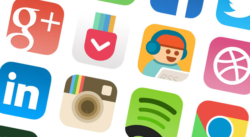
Just remember the fact that you are going to project your app everywhere. So, working on the correct pixels also becomes essential at the same time. You need to create an app which is easily recognizable. One of the things that you can do is check the app design against a variety of backgrounds and choose the one that looks perfect.
Don’t include the Images
In case you are implementing a bold and unique shape for the designing process, then including the images will be of no use. However, if you are really willing to include the photos, then it is highly recommended to use vector images instead.
Another way of incorporating the image into your app is using it is image illustration and addition of letter to it.
Don’t Use Color or Details in Excess
A blog published in MakeAppIcon revealed that the icon looks perfect when it is smaller in size. So, it is best avoiding excessive colors and details which can spoil your design and make your app lose out in the competition. It will be ideal to just make use of two to three colors and try not to overload it.
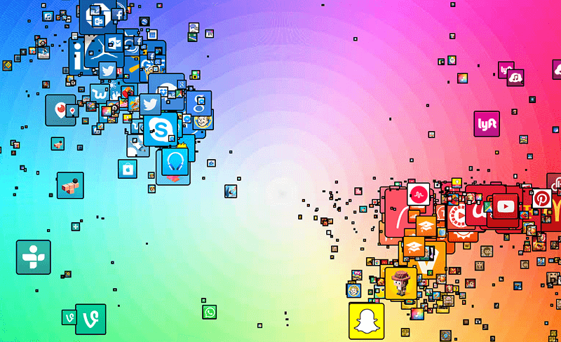
One can cite the example of Snapchat or Watsapp in this context, which has used simple color combinations to create amazing app design. It is also true that a number of new apps found in app store usually copy the design of the popular apps. It was Appbot who came up with this result after conducting a survey. It has also been found that all primary colors including red, blue, green etc are quite popular.
At the same time, it is also important to align colors with your brand. This will highly appeal the users and draw them towards your app. The survey of Secretariat of the Seoul International Color Expo survey tells that 87.4% people give top preference to color for designing the app.
The Exclusion of Words
Since the app icon looks smaller on the screen, the addition of words will not solve your purpose at all. It is because nobody will be interested in reading the text at all. Therefore, the best thing is to exclude it out of your design procedure.
![]()
If you browse your Smartphone thoroughly, you will know that no app contains text in its design. Every app name is mentioned below it. There may be a rare exceptions such as the Facebook which as the letter “f” on its icon. But it is their symbol or identity of the brand.
See, there is no hard and fast rule that you cannot use text or alphabet in the app design, but then you have to come up with some unique idea and establish it as your own symbol.
Implementing the Border
Incorporating the border around the icon image isn’t a bad idea considering the fact that provides a sober look to the app. Again one can put forward the instance of Snapchat, which has used this design feature to a good extent. The Adobe Photoshop Express is another example which can be cited in this context.
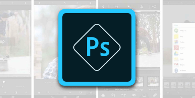
The main functionality of the border is that it highlights the icon which is inside it. And no doubt, the customers also get attracted towards the app. Well, you can design a simple border or give it a 3D impact to exemplify its beauty. A vital point to remember here is using a bright and contrasting color.
Be Well Acquainted with Your Competitors Design
Well, the app business is really stringent out there and you have to be well aware of who your competitors are in order to succeed. Therefore, this goes without saying that you need to have a good knowledge of what designs your competitors are offering. This is specifically related to the shape and color scheme of the app icon.

For instance, if you are creating an app for e-commerce, then you will have to look out at EBay or Amazon and know what designs they have in their kitty. It will be appreciable if you come up with some exclusive idea or design that helps in your venture ahead.
Try and Test Various Combinations
Well, this is a wonderful idea to incorporate if want to make a unique app design and launch it successfully in the market. You can prepare various designs and sketches and try out several icon variations including the color combinations etc. This can be a hectic task but it is a significant step which has to be taken. It makes the designing of the icon easier as you can decide what fits best to suit your app.
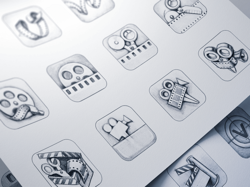
Now one very essential point to note is that you need to check the icon on the screen of your phone before making any final decision. It will give you an idea as to how the icon appears against different wallpapers, screens and colors.
Choosing the Appropriate Size of the Icon
The app icon must be appropriate size in accordance with the screen of the mobile. It shouldn’t be very large or not very tiny so that it literally is not visible properly. The vitality of this design feature can be understood from the fact that Apple will reject your app from its Store, if it is not accurately sized.
If you are going to launch you app in Apple App Store, then you should follow the app icon guidelines carefully to make sure your app is accepted by App Store.
Read also: What Factors Affects Deciding Cost To Design A Mobile App?
A Few Final Words
The app icon design is the most essential aspect for launching a successful app that can create a big buzz around the audiences. Well, it is challenging task because you have to take into consideration some key factors and work upon a design that is acceptable to the app store. If you are following the steps systematically, then you can surely achieve your desired result.


